Wednesday, 5 June 2013

Add All Your Friends In Facebook Group

Add All Your Friends In Facebook Group
Hi friends, in my earlier posts, I told you how to add all your friends in facebook group. But that trick is not working, so I am telling you another working trick which is working with google chrome browser.

Follow the steps below:

  • Click this link (new version updated) to visit the facebook invite all friends extension.
  • Add and install the extension in your browser.
  • After installing the extension, you will see an icon in the top right side of your chrome browser.
  • Now login to the facebook and go to the group page in which you want to add your friends. Now click on the icon which is added in the top right side of the browser.
Add All Your Friends In Facebook Group
  • That's all. You will see that your friends are being added in the group.
Share:

Monday, 20 May 2013

How To Get A Blog


Blogs are very popular way to get audience from worldwide. If you have a blog, you can share your thoughts, your content with the people from worldwide. So, if you want to be connected with people from worldwide, you must create a blog and start blogging. Let's see how to create a blog:
> To create a blog, you need to sign up for an account on Blogger.
> After signing up, create a blog.
> Choose a blog title and blog address for your blog. If the address is available, then select a template and then click Create Blog.
How To Get A Blog
> You can use a custom xml template also. To upload a custom template, just go to your dashboard and then click Template option.
template customization
> Now click Choose File button and then open your template. Then click Upload button to start uploading your template.
uploading custom template
> After uploading your template, you can do some customization by editing template html code. After everything is done, open and see the preview of your blog.
> Now to publish your articles, go to your dashboard and click Create New Post.
create new post
> After typing your article, you can publish it.
Note: You can make your blog more attractive by adding CSS Codes with your posts and by adding gadgets in your template.
Share:

Friday, 17 May 2013

Blogger Launches New Contact Form Gadget

Blogger Launches New Contact Form Gadget
Blogger has recently launched a new Contact Form gadget for the blogger blogs. It was the most awaiting gadget because bloggers who don't have their own hosting space, were using contact forms from third party sites. But now it's the official gadget for blogger, so you don't need to embed any form or use any external code for your blog to add a contact form. Let's see how to add this form in your blog:
> Login to blogger account.
> Go to Layout > Add A Gadget.
> Now, from the More Gadgets section, add the Contact Form gadget and save your layout.
Blogger Launches New Contact Form Gadget
> Open your blog and see the contact form.
Blogger New Contact Form Gadget
Keep visiting for more tricks.
Share:

Sunday, 21 April 2013

Can IDM and uTorrent Cause Hard Disk Crash?

Can IDM and uTorrent Cause Hard Disk Crash?
Internet Download Manager and uTorrent are the most used softwares to download content from the internet because these apps support resumable downloads, it means you can stop your download anytime and can resume it without losing the previously downloaded data. But, do you know, using softwares which provide download resume feature can cause damage to your hard disk and can decrease the life and performance of your hard disk?
Yes, it's true. I personally noticed this thing. I have my experimental PCs and I noticed that the PC in which I was using IDM and uTorrent to download content from internet were started showing Blue Screen of Death error, hanging problems and slow access of the hard disk. But the PC in which I didn't use IDM or uTorrent was running perfectly and even the hard disk of that PC is 8 years old, but still it's working perfectly.

Reason:

hard disk's space distribution
Actually, hard disk is divided in Tracks, Sectors and Clusters. Whenever any data is being downloaded, it is stored in the clusters. The data, which is being downloaded via browser, or whenever you copy data from any external media, it is stored in your hard disk's clusters. Normally, when we download data using a browser, it downloads the data stores the data in the clusters in an arranged manner.
But when we download the data using Internet Download Manager or uTorrent, they download the data in small parts or packets which are stored in the clusters in an unarranged manner, which disturbs the distribution of clusters. After downloading all the packets of data, IDM and uTorrent join them to make a single file, and that data's clusters are not in an arranged and optimized manner. So, hard disk gets fragmented. If we regularly use these apps to download data, our hard disk gets fragmented and starts showing errors and becomes unstable. Thus, our hard disk gets crashed soon because of the damaged clusters.

Possible Solutions:

It will be best that you always use direct browser download method, and avoid using download managers. Use download managers only when you are downloading a very important data and you want it to be resumable. In this way, you can save your hard disk for a long time. But I am suggesting you some ways to keep your hard disk healthy and damage free.

1. Defrag your hard disk once in three months:

If the data in your hard disk gets fragmented then you can defrag it using some tools. In windows, you can get the default defragmenter by going Start > All Programs > Accessories > System Tools > Disk
Defragmenter.
windows disk defragmenter
But I'll suggest you to use any 3rd party software, like AVG PC TUNEUP or TUNEUP UTILITIES to defrag your hard disk. These third party softwares have more powerful defragmenter and they can defrag your hard disk in a better way than windows does.
avg pc tuneup
Warning: If you do frequent defragmentations, your hard disk may damage more fastly due to wear and tear effect. So, don't run defragmentations at short intervals. A gap of at least three months must be taken between two defragmentations.  

2. Fix Disk Erros Weekly:

To keep your hard disk safe from crashes and to make your operating system stable, you must check your hard disk for errors and fix them. You can use windows default Disk Check utility (Normally called CHKDSK when used in command prompt). To check your hard disk errors and fix them, just open my computer. Now, right click on the drive which your want to be checked for errors. Now click PROPERTIES. A window will appear which shows drive properties, click TOOLS tab, then under Error-Checking option, click Check Now button. Disk Check utility will appear, select Automatically fix file system errors and click Start button.
windows disk check utility
You can use AVG PC TUNEUP Utility also. This software has an intelligent disk check utility.

3. Keep At Least 20% Space Free In Hard Disk:

Always keep 20% of the hard disk space free. This will increse the access speed of hard disk and increase the performance of the hard disk.

4. Always use Turn Off before unplugging your pc from power:

Before switching off your pc, always turn it off by going to Start > Turn Off. This will safe your data from any loss and error will not be created in your hard disk and your operating system will be stable.

5. Recovery of bad sectors:

If your hard disk is not showing any improvements after trying these optimizations, then you must check for Bad Sectors and fix them. Most of the times, this feature proves to be life saving for important data during hard disk crash.To start recovery of bad sectors, just follow the steps to open windows disk error check utility and before clicking Start button, select the Scan for and attempt recovery of bad sectors. Then click Start button. When you will restart your pc, windows will check and fix the bad sectors in hard disk. You can use AVG PC TUNEUP Utility for better options.
Share:

Friday, 12 April 2013

Convert Text To Speech In Any Application

Convert Text To Speech In Any Application
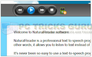
Hi friends, today I am going to tell you about a free software which is great for the users who like to hear the text instead of reading it. This software comes with different male and female voices for different languages.
The software is called Natural Reader.
Its free edition is limited with features but it is also good to have.
text to speech floating bar

Features:

  • It is a text to speech converter software
  • It comes with a floating bar, which helps reading texts from MS Word, PDF Files, Web Pages etc.
  • You can change reading voice and reading speeds also.
  • It supports hot key, means just select the text and press the hotkey. Software will read the selected text for you.
  • It comes in different versions. Free, Personal, Professional, Silver, Gold and Ultimate versions. You can purchase and download the free version of the software from the official site : http://www.naturalreaders.com/index.php
Share:

Friday, 22 March 2013

CSS3 Black Dropdown Menubar For Blogger

CSS3 Black Dropdown Menubar For Blogger
Hi friends, Today, I'm gonna tell you the code to add a black stylish navigation menubar in blogger blog. This menubar looks great and functions smoothly.

Follow The Steps Below:

  • Login to your blogger account.
  • Go to Template > Edit HTML > Proceed.
  • Now, find ]]></b:skin> and just above this line, paste the following code:
/* The CSS Code for the menu starts here pctricksguru.com */
.pctricksguru_menu,.pctricksguru_menu ul,.pctricksguru_menu li,.pctricksguru_menu a {
 margin: 0;
 padding: 0;
 border: none;
 outline: none;
}
.pctricksguru_menu {
 height: 40px;
 width: 525px;
 background: #4c4e5a;
 background: -webkit-linear-gradient(top, #4c4e5a 0%,#2c2d33 100%);
 background: -moz-linear-gradient(top, #4c4e5a 0%,#2c2d33 100%);
 background: -o-linear-gradient(top, #4c4e5a 0%,#2c2d33 100%);
 background: -ms-linear-gradient(top, #4c4e5a 0%,#2c2d33 100%);
 background: linear-gradient(top, #4c4e5a 0%,#2c2d33 100%);
 -webkit-border-radius: 5px;
 -moz-border-radius: 5px;
 border-radius: 5px;
}
.pctricksguru_menu li {
 position: relative;
 list-style: none;
 float: left;
 display: block;
 height: 40px;
}
.pctricksguru_menu li a {
 display: block;
 padding: 0 14px;
 margin: 6px 0;
 line-height: 28px;
 text-decoration: none;
 border-left: 1px solid #393942;
 border-right: 1px solid #4f5058;
 font-family: Helvetica, Arial, sans-serif;
 font-weight: bold;
 font-size: 13px;
 color: #f3f3f3;
 text-shadow: 1px 1px 1px rgba(0,0,0,.6);
 -webkit-transition: color .2s ease-in-out;
 -moz-transition: color .2s ease-in-out;
 -o-transition: color .2s ease-in-out;
 -ms-transition: color .2s ease-in-out;
 transition: color .2s ease-in-out;
}

.pctricksguru_menu li:first-child a { border-left: none; }
.pctricksguru_menu li:last-child a{ border-right: none; }

.pctricksguru_menu li:hover > a { color: #8fde62; }

.pctricksguru_menu ul {
 position: absolute;
 top: 40px;
 left: 0;
 opacity: 0;
 background: #1f2024;
 -webkit-border-radius: 0 0 5px 5px;
 -moz-border-radius: 0 0 5px 5px;
 border-radius: 0 0 5px 5px;
 -webkit-transition: opacity .25s ease .1s;
 -moz-transition: opacity .25s ease .1s;
 -o-transition: opacity .25s ease .1s;
 -ms-transition: opacity .25s ease .1s;
 transition: opacity .25s ease .1s;
}

.pctricksguru_menu li:hover > ul { opacity: 1; }
.pctricksguru_menu ul li {
 height: 0;
 overflow: hidden;
 padding: 0;
 -webkit-transition: height .25s ease .1s;
 -moz-transition: height .25s ease .1s;
 -o-transition: height .25s ease .1s;
 -ms-transition: height .25s ease .1s;
 transition: height .25s ease .1s;
}
.pctricksguru_menu li:hover > ul li {
 height: 36px;
 overflow: visible;
 padding: 0;
}
.pctricksguru_menu ul li a {
 width: 100px;
 padding: 4px 0 4px 40px;
 margin: 0;
 border: none;
 border-bottom: 1px solid #353539;
}
.pctricksguru_menu ul li:last-child a { border: none; }
.pctricksguru_menu a.documents { background: url(https://blogger.googleusercontent.com/img/b/R29vZ2xl/AVvXsEh7ioVhpufHbT7Yg-OP3MN3VE_LCTVQQHZBP9oYPANbXzKTpsb_IUvkap37Nm_3ApD5U5gtuH6G96oShnvQdMkGYCrATec5hV9iX9zesRJ0gWv2iXcul5Q3VU2lV8mzaBGFCr4RvmFDzTHI/s1600/docs.png) no-repeat 6px center; }
.pctricksguru_menu a.messages { background: url(https://blogger.googleusercontent.com/img/b/R29vZ2xl/AVvXsEjKScxG9tEX1FEtQ-lCP0q1jBnGTFC0u37E5Y5YpT2IRpXCKdZPUlJ3QACWylrbmbaeBQ26Xc7MHZp2lIOqYgUr_qwwQ-KZN2XaD7cQPMZO8Ag_t2Lrb-UV2kZEd135DGdiVplqEhJu6106/s1600/bubble.png) no-repeat 6px center; }
.pctricksguru_menu a.signout { background: url(https://blogger.googleusercontent.com/img/b/R29vZ2xl/AVvXsEi7IoyCa_avT4nrMtkupEe0ymlvC8QPxn2WPWGA6kS0ddwsk88phxfb-QuNnU5ZCI06A_00ctx6AvwAyzLNJetHq7cA9aLMgEMh84SLfqOliMGgNnWredeLlFoDEUGMZXxO-eCtLLWX8yAk/s1600/arrow.png) no-repeat 6px center; }
  • Now, save the template.
  • Go to blogger Layout > Add A Gedget > HTML/Javascript Gadget.
  • Copy and paste the following code in the content box:
<ul class="pctricksguru_menu">
 <li><a href="#">Home</a></li>
 <li><a href="#">Likes</a></li>
 <li><a href="#">Views</a>
  <ul>
   <li><a href="#" class="documents">Documents</a></li>
   <li><a href="#" class="messages">Messages</a></li>
   <li><a href="#" class="signout">Sign Out</a></li>
  </ul>
 </li>
 <li><a href="#">Uploads</a></li>
 <li><a href="#">Videos</a></li>
    <li><a href="#">About</a></li>
 <li><a href="http://www.pctricksguru.com/">Contact us</a></li>
</ul>
  • Replace # with your target link and red text with your own text and save the widget.
  • Save the layout and see your blog.
Share:

Thursday, 21 March 2013

Add Author Box Below Each Post In Blogger

Add Author Box Below Each Post In Blogger
Hi friends, you might have seen Author Box in the blogger blogs and wanted to add it in your blog also. So, I am going to tell you an easiest way to add author box below each post in blogger. The only thing you need is to read this tutorial and I have explained it in a very simple way.

Follow The Steps Below:

  • Login to your blogger account.
  • Go to Template > Edit HTML.
  • Now, copy the following code in and paste just above the </head> .
<style>
.mdauthor_info{
float:left;
width:550px;
padding:15px;
border:1px solid #ccc;
margin-bottom:15px;
margin-top:15px;
background:#eee;color:#000;
}
.mdauthor_info:hover{
background:#eee;
border:1px solid #ccc;
-webkit-box-shadow:0px 0px 10px  rgba(0, 0, 0, .3);
-moz-box-shadow:0px 0px 10px  rgba(0, 0, 0, .3);
box-shadow:0px 0px 10px  rgba(0, 0, 0, .3);
}
.mdauthor_info h3{
color:#000;
margin-bottom:10px;
}
.mdauthor_info h3:hover{
border : 1px solid #EEEEEE;
-webkit-box-shadow:0px 0px 10px  rgba(0, 0, 0, .3);
-moz-box-shadow:0px 0px 10px  rgba(0, 0, 0, .3);
box-shadow:0px 0px 10px  rgba(0, 0, 0, .3);
}
.mdauthor_photo{
float:right;
margin:0 0 0 10px;
}
.mdauthor_photo img{
border:1px solid #666;
-webkit-transition:-webkit-transform .15s linear;
-moz-transition:-moz-transform .15s linear;
-o-transition:-o-transform .15s linear;transition:transform .15s linear;
-webkit-box-shadow:0 3px 6px rgba(0,0,0,.25);
-moz-box-shadow:0 3px 6px rgba(0,0,0,.25);
box-shadow:0 3px 6px rgba(0,0,0,.25);
padding:5px 5px 5px 5px;-webkit-transform:rotate(+2deg);
-moz-transform:rotate(+2deg);-ms-transform:rotate(+2deg);
-o-transform:rotate(+2deg);transform:rotate(+2deg);float:left;
}
.mdauthor_photo img:hover{
background:#FFFFFF;
border : 1px solid #EEEEEE;
-webkit-box-shadow:0px 0px 10px  rgba(0, 0, 0, .3);
-moz-box-shadow:0px 0px 10px  rgba(0, 0, 0, .3);
box-shadow:0px 0px 10px  rgba(0, 0, 0, .3);
-webkit-transform:rotate(-1deg);
-moz-transform:rotate(-1deg);
-ms-transform:rotate(-1deg);
-o-transform:rotate(-1deg);
transform:rotate(-1deg);
}
ul.mdsocial{
list-style:none;
margin:10px;
overflow:hidden;
}
.mdsocial li{
float:right;
background:none !important;
padding:0 !important;
margin:0 8px;
}
.mdsocial li a{
display:block;
width:40px;
height:40px;
background:url("https://blogger.googleusercontent.com/img/b/R29vZ2xl/AVvXsEhCctnrGwS_Icd-MfFf1n2GazvLTJlugYWG-J4y0DipfcLcJtP0bS_UVLgCQ1rWhkMFdDsPJ56p3ziVv9CHb9tErtKkSmb7vCBW4EXeSq-QjjEYQ91eolo5ztFynFu_Uc69Je7Z0Yzijz1q/s1600/social.png") no-repeat transparent;
text-indent:-99999em !important;
}
.mdsocial li a:hover{
padding:0 !important;
}
.mdsocial li.rssicon a{
background-position:0 0;
}
.mdsocial li.twicon a{
background-position:-50px 0;
}
.mdsocial li.fbicon a{
background-position:-100px 0;
}
.mdsocial li.gicon a{
background-position:-150px 0;
}
.mdsocial li.rssicon a:hover{
background-position:0 -50px;
}
.mdsocial li.twicon a:hover{
background-position:-50px -50px;
}
.mdsocial li.fbicon a:hover{
background-position:-100px -50px;
}
.mdsocial li.gicon a:hover{
background-position:-150px -50px;
}
.mdlinediv{
margin-top:25px;
height:0px;
clear:both;
display:block;
border-top:1px solid #fefefe;
border-bottom:1px solid #CCCCCC;
}
.mdemailbutton{
background:#f7f8f9;
background:-webkit-gradient(linear,left top,left bottom,color-stop(#f7f8f9,0),color-stop(#e9e9e9,1));
background:-webkit-linear-gradient(top, #f7f8f9 0%, #e9e9e9 100%);
background:-moz-linear-gradient(top, #f7f8f9 0%, #e9e9e9 100%);
background:-o-linear-gradient(top, #f7f8f9 0%, #e9e9e9 100%);
background:linear-gradient(top, #f7f8f9 0%, #e9e9e9 100%);
filter:progid:DXImageTransform.Microsoft.gradient( startColorstr='#f7f8f9', endColorstr='#e9e9e9',GradientType=0 );
border:1px solid #ddd;
-webkit-border-radius:4px;
-moz-border-radius:4px;
border-radius:4px;
padding:6px 12px;
margin:0;-webkit-box-shadow:0 1px 0 #f9f9f9 inset, 1px 1px 1px rgba(223,223,223,0.4);
-moz-box-shadow:0 1px 0 #f9f9f9 inset, 1px 1px 1px rgba(223,223,223,0.4);box-shadow:0 1px 0 #f9f9f9 inset, 1px 1px 1px rgba(223,223,223,0.4);
color:#888;
text-shadow:0 1px 0 #fff;
line-height:1.2;
cursor:pointer;
font-size:13px;
}
.mdemailbutton:hover{
background:#f1f1f1;
background:-webkit-gradient(linear,left top,left bottom,color-stop(#f1f1f1,0),color-stop(#e0e0e0,1));
background:-webkit-linear-gradient(top, #f1f1f1 0%, #e0e0e0 100%);
background:-moz-linear-gradient(top, #f1f1f1 0%, #e0e0e0 100%);
background:-o-linear-gradient(top, #f1f1f1 0%, #e0e0e0 100%);
background:linear-gradient(top, #f1f1f1 0%, #e0e0e0 100%);filter:progid:DXImageTransform.Microsoft.gradient( startColorstr='#f1f1f1', endColorstr='#e0e0e0',GradientType=0 );
text-decoration:none !important;
}
.mdemail{
clear:both;
width:250px;
margin:10px 0;
float:left;
}
.mdemailform{
position:relative;
width:250px;
margin:0 auto;
}
.mdemailinput{
width:200px;
height:18px;
margin:0 auto;
padding:8px 40px 8px 10px;border:1px solid #ddd;
-webkit-border-radius:4px;-moz-border-radius:4px;
border-radius:4px;font-family:georgia;
font-style:italic;
-webkit-box-shadow:1px 1px 2px #dfdfdf;
-moz-box-shadow:1px 1px 2px #dfdfdf;
box-shadow:1px 1px 2px #dfdfdf;
font-size:14px;color:#666;
}
.mdemailbutton{
-webkit-border-top-right-radius:4px;
-webkit-border-bottom-right-radius:4px;
-moz-border-radius-topright:4px;
-moz-border-radius-bottomright:4px;
border-top-right-radius:4px;
border-bottom-right-radius:4px;
-webkit-border-top-left-radius:0px;
-webkit-border-bottom-left-radius:0px;
-moz-border-radius-topleft:0px;
-moz-border-radius-bottomleft:0px;
border-top-left-radius:0px;border-bottom-left-radius:0px;
padding:9px;
position:absolute;
right:-2px;
top:0;
display:block;
line-height:16px;
}
.mdemailbutton{
padding:8px !important;
}
.mdemailform, .mdemailinput{
width:98% !important;
-webkit-box-sizing:border-box;
-moz-box-sizing:border-box;
box-sizing:border-box;
height:auto;
}
</style>
  • Now, copy and paste the following code just after the <data:post.body/> (if this code appears for more than one time, then paste the code after second appearance) code and replace the colored text with your own profile links then save your template. 
<div class='mdauthor_info'><div class='mdauthor_photo'>
<img alt='author' height='150' src='YOUR IMAGE URL HERE' width='150'/>
</div>
<h2>About The Author:</h2>
<p>YOUR AUTHOR BIO HERE </p>
<div class='mdlinediv'>
</div>
<div class='mdemail'>
<small style='text-align:center;'>Get Free Email Updates In Your Inbox!</small>
<form action='http://feedburner.google.com/fb/a/mailverify' class='mdemailform' method='post' onsubmit='window.open(&#39;http://feedburner.google.com/fb/a/mailverify?uri=pctricksguru&#39;, &#39;popupwindow&#39;, &#39;scrollbars=yes,width=550,height=520&#39;);return true' target='popupwindow'>
<input name='uri' type='hidden' value='pctricksguru'/>
<input name='loc' type='hidden' value='en_US'/>
<input class='mdemailinput' name='email' onblur='if (this.value == "") {this.value = "Enter your email...";}' onfocus='if (this.value == "Enter your email...") {this.value = ""}' type='text' value='Enter your email...'/>
<input class='mdemailbutton' title='' type='submit' value='Subscribe'/>
</form>
</div>
<ul class='mdsocial'>
<li class='rssicon'>
<a href='YOUR FEEDBURNER URL'>Rss</a>
</li><li class='twicon'>
<a href='YOUR TWITTER URL'>Twitter</a>
</li><li class='fbicon'>
<a href='YOUR FACEBOOK URL'>Facebook</a>
</li><li class='gicon'>
<a href='YOUR GOOGLE PLUS URL'>Google +</a>
</li>
</ul>
</div>
    • That's it. Check your blog.
    Share:

    Monday, 18 March 2013

    Ice Cube Style Social Sharing Widget For Blogger

    Ice Cube Style Social Sharing Widget For Blogger
    Hi friends, today I have one more social sharing widget for blogger which is ice cube styled. So, I am going to tell you how to add ice cube sharing widget in blogger. On mouse hover, the cube gets enlarged. Let's start.

    Follow The Steps Below:

    • Login to your blogger account.
    • Go to Layout > Add A Gadget > Add HTML/Javascrpt Gadget.
    • Copy and paste this code in the content box:
    <style>
    /* ICE Cube Widget By www.pctricksguru.com  */
    .bubblewrap{
    list-style-type:none;
    margin:0;
    padding:0;
    }
    .bubblewrap li{
    display:inline;
    width: 60px;
    height:60px;
    }
    .bubblewrap li img{
    width: 50px; /* width of each image.*/
    height: 50px; /* height of each image.*/
    border:0;
    margin-right: 4px; /*spacing between each image*/
    -webkit-transition:-webkit-transform 0.1s ease-in; /*animate transform property */
    -o-transition:-o-transform 0.1s ease-in; /*animate transform property in Opera */
    }
    .bubblewrap li img:hover{
    -moz-transform:scale(1.8); /*scale up image 1.8x*/
    -webkit-transform:scale(1.8);
    -o-transform:scale(1.8);
    }</style>
    <br />
    <center>
    <br />
    <ul class="bubblewrap">
    <li><a href="http://www.linkedin.com/xxxxxx"><img src="https://blogger.googleusercontent.com/img/b/R29vZ2xl/AVvXsEjGtC3tFHSxi20xpPGunacTEwJdptH4dsGZ6ztjteoHlBzetkJ2QugGuaCFiZ_DbKGuA1MuiRMtXNQwyH75PZaFXNMXM7coC_HEMtMlXrS6fhMjLBNJ6CWm81nD9wTilAJKlNmcF8do0co/s1600/pctricksguru_linkedin.png" title="Add to Facebook" /></a></li>
    <li><a href="http://www.facebook.com/xxxxxx"><img src="https://blogger.googleusercontent.com/img/b/R29vZ2xl/AVvXsEjjSlrruPRhgIePLPMkKvx9X5T7Yzs7cs27H-6oID_P1oBYIs8tlI-Oq8CHQ472lGklD9TlG_TH1g8-Q9cWYuK2JXJmpBvLj3nLfeTJBrJ7EHAAQc1_USshbr83bW2bxw7_GHHxSKWWPi8/s1600/pctricksguru_facebook.png" title="Add to Facebook" /></a></li>
    <li><a href="http://www.stumbleupon.com/xxxxxx"><img src="https://blogger.googleusercontent.com/img/b/R29vZ2xl/AVvXsEiFAOW78p4OIXvx8A9k60Ule1vRZeAmxHPfL27QhD6nlZqXDk8if4i1w1bkSlrsuQxxAM-Q9j5MM2elRpypIx5-u12Lv7hku2_xpjaUtXEQ04qrN_9c54OCGsVanJacS0FDncaiGEbEOWM/s1600/pctricksguru_stumble.png" title="Add to Digg" /></a></li>
    <li><a href="http://www.twitter/xxxxxx"><img src="https://blogger.googleusercontent.com/img/b/R29vZ2xl/AVvXsEhIPFJGxBxbvHRhjDjnWYez4u2xKEbGHw6YT5zN8gHs9B1pAvaYlkP2em5NkY7BWNx3eY6mBusy8c9bBBntZVJ_sfEyf6Ckrs5Y-p6_pUDqh4IevdD40yjs4oud79ghSLi8FsFM_FqlUgs/s1600/pctricksguru_twitter.png" title="Add to Twitter" /></a></li>
    <li><a href="http://feeds.feedburner.com/xxxxxx"><img src="https://blogger.googleusercontent.com/img/b/R29vZ2xl/AVvXsEggh7jPKPpi5WvE-BoND40njmDCKs_3AAWDGxZWpx3Ikke-5NiqVCf2MJYZ3UMV9y0HPl6x-o175e0QiAJx46EVtBadT5Jr9O1BHxtEKfxAu38CzVrmfl65x46CMehPsySdpeVLC1ztGKc/s1600/pctricksguru_rss.png" title="Add RSS Feed" /></a></li>
    </ul>
    </center>
    • Now save the widget and save the layout.
    • Open your blog and see the ice cube styled social sharing buttons.
    Note: Replace the red text with your social media urls.
    Share:

    Sunday, 17 March 2013

    Wooden Style Social Media Widget For Blogger

    Wooden Style Social Media Widget For Blogger
    Hi friends, today, I'm gonna show you how to add a classic wooden style social media widget in blogger. This looks pretty in the blogs having a classic template and it works with any template, so you are not bound to use it with classic templates only, you can use it in any template. The social icons will show a lighting effect on mouse hover. So, let's start.

    Follow the steps below:

    • Login to your blogger account.
    • Navigate to Layout > Add A New Widget > Add HTML/Javascript Widget.
    • Now, copy and paste this code in the content box:
    <style>
    /* ---Wooden Styled Social Icons By www.pctricksguru.com--- */
    a.social-icons {
     margin-right: 5px; /*Adjust This Value As Needed*/
    height:45px;
    width:45px;
    }
    a.social-icons:hover {
     opacity: .7;
     filter:alpha(opacity=70); /* For IE8 and earlier */
    }   height:45px;
    width:45px;
    </style>
    <a class="social-icons" href="https://facebook.com/xxxxxxxx"><img src="https://blogger.googleusercontent.com/img/b/R29vZ2xl/AVvXsEixGGcZ9zzP1U8wyzM1oXUyxNFkqCLZVvjUawfim07aYw6R6rk0jUb4c_lbV_rCAQUhKAYM4cV4Au7wAtfbdp67pJwFmYs6_iJ_IOOezDA99zKDiXSF6HgeK_RyVe4wdvoM8ubhcU8tGcI/s1600/pctricksguru_facebook-icon.png" /></a>
    <a class="social-icons" href="https://twitter.com/xxxxxxxx"><img src="https://blogger.googleusercontent.com/img/b/R29vZ2xl/AVvXsEiw5xXhlPyEfMilmIGJQsCQ7j5erwb_BIm5ddYvenlLueJaGQGRERqvxuYlJXpqOKCj-3FHo_NiLxFk_auPAjToTYVPwuBlkE7naWuxFMU_5iogDhDRqCvFa4NMTcJ1xx0VomtWuxuASA4/s1600/pctricksguru_twitter-icon.png" /></a>
    <a class="social-icons" href="https://digg.com/xxxxxxxx"><img src="https://blogger.googleusercontent.com/img/b/R29vZ2xl/AVvXsEi4Mala7KBUzQeECUHolIJzU_bkELDJ_z9XrCsvcRPdj_6NWwtYDOU3wRES7xI3yY8lGqOgFTB81GJWDC-kBhz3DvgsTDEjwKAjJ-R90vSqFjCgMTWEO9hDY2PETB7-qerEatyO7jEQLy8/s1600/pctricksguru_digg-icon.png" /></a>
    <a class="social-icons" href="http://www.feedburner.com/xxxxxxxx"><img src="https://blogger.googleusercontent.com/img/b/R29vZ2xl/AVvXsEi_cRtC4uYaJONIrLbdSxHta60-rtEwTxv0xqgAGlA4_Nzh8-QjFlluhR9ZlnlndYTKcWuCUcAEPL3F14qWGbRjV6MnZ2xwR8v7Utt5_eDAaxw70dFFIHyFS2slOgNNPjzPzDzr2mqft4U/s1600/pctricksguru_rss-icon.png" /></a>
    <a class="social-icons" href="http://stumbleupon.com/xxxxxxxx"><img src="https://blogger.googleusercontent.com/img/b/R29vZ2xl/AVvXsEhAZULVPcFRjvJC4XAhDV7d2YMeSeb_DfWWJZJUMIsimFFkPD-RDlomoQT95dYGgRAjKdfsvSmkn_7-nyh70_KciuwUzvft1ghXRWfZlh96top0kOLecGiHC-hNbadpz3UquIq4fkTYFF8/s1600/pctricksguru_stumble-icon.png" /></a>
    • Now save your gadget and view your blog.
    Note: Replace the red text with your social media profile urls.
    Share:

    Saturday, 16 March 2013

    Sliding JQuery Image Gallery For Blogger

    Sliding JQuery Image Gallery For Blogger
    Hi friends. Today, I am going to provide you one more sliding image gallery for blogger. This gallery is JQuery powered and looks great. It contains Previous and Next buttons also and it contains image description also. So, let's start.

    Follow The Instructions:

    • Login to your blogger account.
    • Go to Layout > Add A New Gadget > Add HTML/Javascript Gadget.
    • Copy and paste this code in the content box:
    <script type="text/javascript" src="https://pctricksguru.googlecode.com/files/jquery-1.3.1.min.js"></script>
    <script type="text/javascript" src="https://pctricksguru.googlecode.com/files/jquery.scrollTo.js"></script>
    <script>
    $(document).ready(function() {

     //Speed of the slideshow
     var speed = 5000;

     //You have to specify width and height in #slider CSS properties
     //After that, the following script will set the width and height accordingly
     $('#mask-gallery, #gallery li').width($('#slider').width());
     $('#gallery').width($('#slider').width() * $('#gallery li').length);
     $('#mask-gallery, #gallery li, #mask-excerpt, #excerpt li').height($('#slider').height());

     //Assign a timer, so it will run periodically
     var run = setInterval('newsscoller(0)', speed);

     $('#gallery li:first, #excerpt li:first').addClass('selected');

     //Pause the slidershow with clearInterval
     $('#btn-pause').click(function () {
      clearInterval(run);
      return false;
     });

     //Continue the slideshow with setInterval
     $('#btn-play').click(function () {
      run = setInterval('newsscoller(0)', speed);
      return false;
     });

     //Next Slide by calling the function
     $('#btn-next').click(function () {
      newsscoller(0);
      return false;
     });

     //Previous slide by passing prev=1
     $('#btn-prev').click(function () {
      newsscoller(1);
      return false;
     });

     //Mouse over, pause it, on mouse out, resume the slider show
     $('#slider').hover(

      function() {
       clearInterval(run);
      },
      function() {
       run = setInterval('newsscoller(0)', speed); });});


    function newsscoller(prev) {

     //Get the current selected item (with selected class), if none was found, get the first item
     var current_image = $('#gallery li.selected').length ? $('#gallery li.selected') : $('#gallery li:first');
     var current_excerpt = $('#excerpt li.selected').length ? $('#excerpt li.selected') : $('#excerpt li:first');

     //if prev is set to 1 (previous item)
     if (prev) {

      //Get previous sibling
      var next_image = (current_image.prev().length) ? current_image.prev() : $('#gallery li:last');
      var next_excerpt = (current_excerpt.prev().length) ? current_excerpt.prev() : $('#excerpt li:last');

     //if prev is set to 0 (next item)
     } else {

      //Get next sibling
      var next_image = (current_image.next().length) ? current_image.next() : $('#gallery li:first');
      var next_excerpt = (current_excerpt.next().length) ? current_excerpt.next() : $('#excerpt li:first');
     }

     //clear the selected class
     $('#excerpt li, #gallery li').removeClass('selected');

     //reassign the selected class to current items
     next_image.addClass('selected');
     next_excerpt.addClass('selected');

     //Scroll the items
     $('#mask-gallery').scrollTo(next_image, 800);
     $('#mask-excerpt').scrollTo(next_excerpt, 800);     }

    </script>
    <style>

    #slider {

     /* You MUST specify the width and height */
     width:660px;
     height:275px;
     position:relative;
     overflow:hidden;
    -moz-box-shadow: 0px  0px 6px #000000;
    -webkit-box-shadow: 0px 0px 6px #000000;
    box-shadow: 0px 0px 6px #000000;
    }
    #mask-gallery {
     overflow:hidden;
    }

    #gallery {
     list-style:none;
     margin:0;
     padding:0;
     z-index:0;
     width:900px;
     overflow:hidden;
    }
     #gallery li {
      float:left;
     }
    #mask-excerpt {
     position:absolute;
     top:0;
     left:0;
     z-index:500;
     width:100px;
     overflow:hidden;
     }

    #excerpt {
     filter:alpha(opacity=60);
     -moz-opacity:0.6;
     -khtml-opacity: 0.6;
     opacity: 0.6;

     list-style:none;
     margin:0;
     padding:0;

     z-index:10;
     position:absolute;
     top:0;
     left:0;

     width:100px;
     background-color:#000;
     overflow:hidden;
     font-family:arial;
     font-size:14px;
     color:#fff;
    }

     #excerpt li {
      padding:5px;
     }

    .clear {
     clear:both;
    }
    #btn-prev {
       border-top: 1px solid #96d1f8;
       background: #65a9d7;
       padding: 4px 8px;
       -webkit-border-radius: 8px;
       -moz-border-radius: 8px;
       border-radius: 8px;
       -webkit-box-shadow: rgba(0,0,0,1) 0 1px 0;
       -moz-box-shadow: rgba(0,0,0,1) 0 1px 0;
       box-shadow: rgba(0,0,0,1) 0 1px 0;
       text-shadow: rgba(0,0,0,.4) 0 1px 0;
       color: white;
       font-size: 9px;
       font-family: Georgia, serif;
       text-decoration: none;
       vertical-align: middle;
       }
    #btn-prev:hover {
       border-top-color: #28597a;
       background: #28597a;
       color: #ccc;
       }
    #btn-prev:active {
       border-top-color: #238acf;
       background: #238acf;
       }
    #btn-next {
       border-top: 1px solid #96d1f8;
       background: #65a9d7;
       padding: 4px 8px;
       -webkit-border-radius: 8px;
       -moz-border-radius: 8px;
       border-radius: 8px;
       -webkit-box-shadow: rgba(0,0,0,1) 0 1px 0;
       -moz-box-shadow: rgba(0,0,0,1) 0 1px 0;
       box-shadow: rgba(0,0,0,1) 0 1px 0;
       text-shadow: rgba(0,0,0,.4) 0 1px 0;
       color: white;
       font-size: 9px;
       font-family: Georgia, serif;
       text-decoration: none;
       vertical-align: middle;
       }
    #btn-next:hover {
       border-top-color: #28597a;
       background: #28597a;
       color: #ccc;
       }
    #btn-next:active {
       border-top-color: #238acf;
       background: #238acf;
       }
    </style>
    <div id="debug"></div>
    <div id="slider">

     <div id="mask-gallery">
     <ul id="gallery">
      <li><img src="https://blogger.googleusercontent.com/img/b/R29vZ2xl/AVvXsEgFW7COwKCSlWzrooV6UF1ixQ4itWESkrkNBUwqjuRrV81c_G-B0y6LMUeIbSEbz2jj1Psvtm_nAgzuPQsDe0DXRRs-kGRDfjoKTHlUcJBXGHRsJ-f4n3W4qbzmmccE8sEfBzMmIaAuU4I/s1600/ptg_image2.jpg" width="660" height="275" alt=""/></li>
      <li><img src="https://blogger.googleusercontent.com/img/b/R29vZ2xl/AVvXsEhs7iswBk9H3RYV7r0sY1NTR20EXdPhza_kWh3B3wbh8xsq2kbW5SuWY8xO5n0IBIgi6ZZC1efqA69jzmCqqMqXh0JKrkwnid_x0aFOS-hszKCEjBQcV1Hi7k-hphHUcyRYbaeRE1OKi34/s1600/ptg_image1.jpg" width="660" height="275" alt=""/></li>
      <li><img src="https://blogger.googleusercontent.com/img/b/R29vZ2xl/AVvXsEhxRhVWaHRkR22zvUNcTkAz4n7fBh-Pat4jn9ilJRPlH3iQnnmP4O2YO2n-4gigpy_eRU5dvZlTjWn6YgZnPsJEYSS17jWRYSjx-pwMola3ajQalX0ULJYXnKHAYeSyOwjUY6bS0d02tpQ/s1600/ptg_image3.jpg" width="660" height="275" alt=""/></li>
      <li><img src="https://blogger.googleusercontent.com/img/b/R29vZ2xl/AVvXsEj8WvCZJa2F3OT1vu0YCOd0KYtp3VKFutU_ZcR0fp2nhGXGEXOFffLPFWjinhJSbCm8tZJ0TXtcKvBOK5bNqblZ_U1Z4VoaLWkeifb8UsBNAtt3D79pfn2EIt3KmL99ONWuP6BvBgagiSo/s1600/ptg_image5.jpg" width="660" height="275" alt=""/></li>
      <li><img src="https://blogger.googleusercontent.com/img/b/R29vZ2xl/AVvXsEjX7Q37JNRUdD4FHxqgFuobH-QAp6QUnNUdRb53uoVZowaWReHb22IezfLo0WGM964BxSpv5Cz3zsGdbGrVgleKlt9gRa0pSflOqyF7t86m3ErO2T0C-zmSiYwvs1Um0Y_EQIz5TfKSU88/s1600/ptg_image4.jpg" width="660" height="275" alt=""/></li>
     </ul>
     </div>
     <div id="mask-excerpt">
     <ul id="excerpt">
      <li>THIS IS THE DESCRIPTION 1</li>
      <li>THIS IS THE DESCRIPTION 2</li>
      <li>THIS IS THE DESCRIPTION 3</li>
      <li>THIS IS THE DESCRIPTION 4</li>
      <li>THIS IS THE DESCRIPTION 5</li> </ul>
     </div>
    </div>
    <div id="buttons" style="width: 100px;margin-left: 260px;padding-left: 25px;height: 25px;">
     <a href="#" id="btn-prev">prev</a>
     <a href="#" id="btn-next">next</a>
    </div>
    <div class="clear"></div>
    • Now save the gadget and open your blog to see the image gallery.
    Note: Replace the RED text with your image link and BLUE text with image description.
    Share:

    How To Reset Windows 8 Password

    How To Reset Windows 8 Password
    Windows 8 is the latest operating system by Microsoft. It is really bundled with the great features and is is said to be the most secured windows operating system ever. So, it is really difficult to recover the forgotten password of Windows 8. If you search for the password recovery tricks for windows 8 on the net, then you will find so many, but hardly any of them will work properly. The best way to recover windows passwords is the password recovery disk, which can be created via windows operating system itself, but it will be really horrible if you have not created the password reset disk and have forgotten your password.
    Well, there is a powerful software to create windows 8 password recovery disk. You can install this software in any other working computer and then burn your windows 8 password recovery disk or can create a windows 8 password recovery USB stick.

    Creating Password Recovery Disk/USB Stick:

    • First of all, you will need to download Anmosoft Windows Password Reset Software and install it in a working pc.
    • Then, insert a blank CD/DVD or USB Stick in the pc in which you installed Anmosoft Windows Password Reset Software.
    • Now, run the installed software.
    • Now, select the device drive in which you want to burn the Windows 8 Password Reset files and click Start.
    creating windows 8 password recovery disk
    • Now, click Yes to start and finish the burning process.
    creating windows 8 password recovery disk

    Resetting the forgotten password of Windows 8:

    • Insert the Windows 8 password reset disk/USB Stick in the locked computer and restart it.
    • Then select the drive in which windows 8 is installed and click Next. You will see the required drive list in the box.
    reset windows 8 password
    • Now, select the user accounts of which you want to reset the password and click Next.
    reset windows 8 password
    • The password reset process will start and after successful password reset, eject the recovery disk/USB Stick from your computer and restart the pc.
    reset windows 8 password
    • Your computer will not be logged in without asking for any password.

    Other Editions Of Anmosoft Windows Password Reset:

    This software is available in three editions:
    1. Anmosoft Windows Password Reset Standard (Price : $19.95)
    2. Anmosoft Windows Password Reset Professional (Price : $29.95)
    3. Anmosoft Windows Password Reset Ultimate (Price : $49.95)
    The best thing of this software is that it is a standalone software to reset the passwords of Windows XP, Windows Vista, Windows Server 2008, Windows Server 2003, Windows Server 2000, Windows 7 and Windows 8. So, it's very useful for everyone in the case of forgotten password. You can purchase the software for unlimited use and free lifetime upgrade from the official site of Anmosoft Windows Password Reset Software.
    Share:

    Friday, 15 March 2013

    Awesome Image Gallery For Blogger

    Awesome Image Gallery For Blogger
    Hi friends, today, I am going to share the code to create a stylish Image gallery for blogger. In this image gallery, if you click any image, it comes forward and enlarges itself, when you click other image, the previous image is restored to it's original size and the selected image becomes enlarged with slide effect. Let's start.

    Follow The Instructions:

    • Login to your blogger account.
    • Go to Template > Edit HTML > Proceed.
    • Now, press ctrl+F keys and search for ]]></b:skin>.
    • Now, copy and paste this code just above ]]></b:skin>.
    /* Page layout styles */
    *{
        margin:0;
        padding:0;
    }
    body {
        background-color:#fff;
        color:#fff;
        font:14px/1.3 Arial,sans-serif;
    }
    header {
        background-color:#212121;
        box-shadow: 0 -1px 2px #111111;
        display:block;
        height:70px;
        position:relative;
        width:100%;
        z-index:100;
    }
    header h2{
        font-size:22px;
        font-weight:normal;
        left:50%;
        margin-left:-400px;
        padding:22px 0;
        position:absolute;
        width:540px;
    }
    header a.stuts,a.stuts:visited{
        border:none;
        text-decoration:none;
        color:#fcfcfc;
        font-size:14px;
        left:50%;
        line-height:31px;
        margin:23px 0 0 110px;
        position:absolute;
        top:0;
    }
    header .stuts span {
        font-size:22px;
        font-weight:bold;
        margin-left:5px;
    }

    /* Photo Gallery styles */
    .gallery {
        margin: 100px auto 0;
        width: 800px;
    }
    .gallery a {
        display: inline-block;
        height: 135px;
        position: relative;
        width: 180px;

        /* CSS3 Prevent selections */
        -moz-user-select: none;
        -webkit-user-select: none;
        -khtml-user-select: none;
        user-select: none;
    }
    .gallery a img {
        border: 8px solid #fff;
        border-bottom: 20px solid #fff;
        cursor: pointer;
        display: block;
        height: 100%;
        left: 0px;
        position: absolute;
        top: 0px;
        width: 100%;
        z-index: 1;

        /* CSS3 Box sizing property */
        -moz-box-sizing: border-box;
        -webkit-box-sizing: border-box;
        -o-box-sizing: border-box;
        box-sizing: border-box;

        /* CSS3 transition rules */
        -webkit-transition: all 1.0s ease;
        -moz-transition: all 1.0s ease;
        -o-transition: all 1.0s ease;
        transition: all 1.0s ease;

        /* CSS3 Box Shadow */
        -moz-box-shadow: 2px 2px 4px #444;
        -webkit-box-shadow: 2px 2px 4px #444;
        -o-box-shadow: 2px 2px 4px #444;
        box-shadow: 2px 2px 4px #444;
    }

    /* Custom CSS3 rotate transformation */
    .gallery a:nth-child(1) img {
        -moz-transform: rotate(-25deg);
        -webkit-transform: rotate(-25deg);
        transform: rotate(-25deg);
    }
    .gallery a:nth-child(2) img {
        -moz-transform: rotate(-20deg);
        -webkit-transform: rotate(-20deg);
        transform: rotate(-20deg);
    }
    .gallery a:nth-child(3) img {
        -moz-transform: rotate(-15deg);
        -webkit-transform: rotate(-15deg);
        transform: rotate(-15deg);
    }
    .gallery a:nth-child(4) img {
        -moz-transform: rotate(-10deg);
        -webkit-transform: rotate(-10deg);
        transform: rotate(-10deg);
    }
    .gallery a:nth-child(5) img {
        -moz-transform: rotate(-5deg);
        -webkit-transform: rotate(-5deg);
        transform: rotate(-5deg);
    }
    .gallery a:nth-child(6) img {
        -moz-transform: rotate(0deg);
        -webkit-transform: rotate(0deg);
        transform: rotate(0deg);
    }
    .gallery a:nth-child(7) img {
        -moz-transform: rotate(5deg);
        -webkit-transform: rotate(5deg);
        transform: rotate(5deg);
    }
    .gallery a:nth-child(8) img {
        -moz-transform: rotate(10deg);
        -webkit-transform: rotate(10deg);
        transform: rotate(10deg);
    }
    .gallery a:nth-child(9) img {
        -moz-transform: rotate(15deg);
        -webkit-transform: rotate(15deg);
        transform: rotate(15deg);
    }
    .gallery a:nth-child(10) img {
        -moz-transform: rotate(20deg);
        -webkit-transform: rotate(20deg);
        transform: rotate(20deg);
    }
    .gallery a:nth-child(11) img {
        -moz-transform: rotate(25deg);
        -webkit-transform: rotate(25deg);
        transform: rotate(25deg);
    }
    .gallery a:nth-child(12) img {
        -moz-transform: rotate(30deg);
        -webkit-transform: rotate(30deg);
        transform: rotate(30deg);
    }

    .gallery a:focus img {
        cursor: default;
        height: 250%;
        left: -150px;
        top: -100px;
        position: absolute;
        width: 250%;
        z-index: 25;

        /* CSS3 transition rules */
        -webkit-transition: all 1.0s ease;
        -moz-transition: all 1.0s ease;
        -o-transition: all 1.0s ease;
        transition: all 1.0s ease;

        /* CSS3 transform rules */
        -moz-transform: rotate(0deg);
        -webkit-transform: rotate(0deg);
        -o-transform: rotate(0deg);
        transform: rotate(0deg);
    }
    • Now save your template.
    • Now, go to Layout > Add A New Gadget > Add HTML/Javascript Gadget.
    • Copy and paste this code in the content box and save your gadget.
    <div class="gallery">
    <a tabindex="1"><img src="IMAGE LINK 1" /></a>
    <a tabindex="2"><img src="IMAGE LINK 2" /></a>
    <a tabindex="3"><img src="IMAGE LINK 3" /></a>
    <a tabindex="4"><img src="IMAGE LINK 4" /></a>
    <a tabindex="5"><img src="IMAGE LINK 5" /></a>
    <a tabindex="6"><img src="IMAGE LINK 6" /></a>
    <a tabindex="7"><img src="IMAGE LINK 7" /></a>
    <a tabindex="8"><img src="IMAGE LINK 8" /></a>
    <a tabindex="9"><img src="IMAGE LINK 9" /></a>
    <a tabindex="10"><img src="IMAGE LINK 10" /></a>
    <a tabindex="11"><img src="IMAGE LINK 11" /></a>
    <a tabindex="12"><img src="IMAGE LINK 12" /></a>
    </div>
    • Open your blog and see the image gallery.
    Note: Replace IMAGE LINK 1, IMAGE LINK 2, IMAGE LINK 3...... with your own image links.
    Share:

    Thursday, 14 March 2013

    CSS3 Menubar For Blogger With Transition Effect

    CSS3 Menubar For Blogger With Transition Effect
    Hey friends, here is one more stylish css3 powered menubar for blogger. You must check it out. This menubar is CSS3 powered, so it doesn't slow down your blog speed and it increases the attraction of your blog also. So, let's start with the tutorial.

    Follow the steps below:

    • Login to your blogger account.
    • Navigate to Template > Edit HTML > Proceed > Expand Widget Templates.
    • Now, find the code ]]></b:skin> and just above it, paste the code given below:
    /* The CSS Code for the menu starts here pctricksguru.com */
    @import url(http://fonts.googleapis.com/css?family=Dosis:400,700);
    .navbar {
     font-family: 'Dosis', sans-serif;
     position:relative;
     display:table;
     float:none;
     list-style-type:none;
     padding:0;
     margin:20px auto 250px auto;
    }
    .navbar:before {
     position:absolute;
     display:block;
     content: "";
     z-index:-1;
     width:100%;
     height:18px;
     bottom:-9px;
     left:2px;
     background: -moz-radial-gradient(center, ellipse cover,  rgba(0,0,0,0.7) 0%, rgba(0,0,0,0) 75%);
     background: -webkit-gradient(radial, center center, 0px, center center, 100%, color-stop(0%,rgba(0,0,0,0.7)), color-stop(75%,rgba(0,0,0,0)));
     background: -webkit-radial-gradient(center, ellipse cover,  rgba(0,0,0,0.7) 0%,rgba(0,0,0,0) 75%);
     background: -o-radial-gradient(center, ellipse cover,  rgba(0,0,0,0.7) 0%,rgba(0,0,0,0) 75%);
     background: -ms-radial-gradient(center, ellipse cover,  rgba(0,0,0,0.7) 0%,rgba(0,0,0,0) 75%);
     background: radial-gradient(center, ellipse cover,  rgba(0,0,0,0.7) 0%,rgba(0,0,0,0) 75%);
     filter: progid:DXImageTransform.Microsoft.gradient( startColorstr='#b3000000', endColorstr='#00000000',GradientType=1 );
     opacity:.4;
    }
    .navbar:after {
     position:absolute;
     display:block;
     content: "";
     z-index:-1;
     width:100%;
     height:100%;
     top:0;
     left:0;
     -webkit-box-shadow: 0px 2px 4px 0px rgba(0, 0, 0, 0.25);
     box-shadow: 0px 2px 4px 0px rgba(0, 0, 0, 0.25);
    }
    .navbar > li {
     position:relative;
     float:left;
     display:inline-block;
     list-style-type:none;
     text-align:center;
     margin:0;
     border-left:0;
     border:1px solid rgba(0,0,0,0.5);
     line-height:35px;
     -webkit-box-shadow: inset 1px 1px 0px 0px rgba(255, 255, 255, 0.25);
        box-shadow: inset 1px 1px 0px 0px rgba(255, 255, 255, 0.25);
     -webkit-transition: all 300ms ease-in-out;
     -moz-transition: all 300ms ease-in-out;
     -ms-transition: all 300ms ease-in-out;
     -o-transition: all 300ms ease-in-out;
     transition: all 300ms ease-in-out;
    }
    .navbar.color1 > li {
     background:#ea7900;
    }
    .navbar.color2 > li {
     background:#336277;
    }
    .navbar.color3 > li {
     background:#3e781b;
    }
    .navbar.color4 > li {
     background:#ad2259;
    }
    .navbar.color5 > li {
     background:#b20a22;
    }
    .navbar > li:before {
     position:absolute;
     display:block;
     content: "";
     z-index:1;
     width:100%;
     height:100%;
     left:0;
     top:0;
     background: -moz-linear-gradient(top,  rgba(255,255,255,0.15) 0%, rgba(0,0,0,0.16) 100%);
     background: -webkit-gradient(linear, left top, left bottom, color-stop(0%,rgba(255,255,255,0.15)), color-stop(100%,rgba(0,0,0,0.16)));
     background: -webkit-linear-gradient(top,  rgba(255,255,255,0.15) 0%,rgba(0,0,0,0.16) 100%);
     background: -o-linear-gradient(top,  rgba(255,255,255,0.15) 0%,rgba(0,0,0,0.16) 100%);
     background: -ms-linear-gradient(top,  rgba(255,255,255,0.15) 0%,rgba(0,0,0,0.16) 100%);
     background: linear-gradient(top,  rgba(255,255,255,0.15) 0%,rgba(0,0,0,0.16) 100%);
     filter: progid:DXImageTransform.Microsoft.gradient( startColorstr='#26ffffff', endColorstr='#29000000',GradientType=0 );
    }
    .navbar > li:after {
     position:absolute;
     display:block;
     content:"";
     width:100%;
     height:100%;
     top:0;
     left:0;
     background: url("data:image/png;base64,iVBORw0KGgoAAAANSUhEUgAAAAUAAAAFCAYAAACNbyblAAAAGXRFWHRTb2Z0d2FyZQBBZG9iZSBJbWFnZVJlYWR5ccllPAAAAyJpVFh0WE1MOmNvbS5hZG9iZS54bXAAAAAAADw/eHBhY2tldCBiZWdpbj0i77u/IiBpZD0iVzVNME1wQ2VoaUh6cmVTek5UY3prYzlkIj8+IDx4OnhtcG1ldGEgeG1sbnM6eD0iYWRvYmU6bnM6bWV0YS8iIHg6eG1wdGs9IkFkb2JlIFhNUCBDb3JlIDUuMC1jMDYxIDY0LjE0MDk0OSwgMjAxMC8xMi8wNy0xMDo1NzowMSAgICAgICAgIj4gPHJkZjpSREYgeG1sbnM6cmRmPSJodHRwOi8vd3d3LnczLm9yZy8xOTk5LzAyLzIyLXJkZi1zeW50YXgtbnMjIj4gPHJkZjpEZXNjcmlwdGlvbiByZGY6YWJvdXQ9IiIgeG1sbnM6eG1wPSJodHRwOi8vbnMuYWRvYmUuY29tL3hhcC8xLjAvIiB4bWxuczp4bXBNTT0iaHR0cDovL25zLmFkb2JlLmNvbS94YXAvMS4wL21tLyIgeG1sbnM6c3RSZWY9Imh0dHA6Ly9ucy5hZG9iZS5jb20veGFwLzEuMC9zVHlwZS9SZXNvdXJjZVJlZiMiIHhtcDpDcmVhdG9yVG9vbD0iQWRvYmUgUGhvdG9zaG9wIENTNS4xIFdpbmRvd3MiIHhtcE1NOkluc3RhbmNlSUQ9InhtcC5paWQ6OERFQkEzRUJDNUM5MTFFMUE3NzBCMTZBMEExNEQ5NUQiIHhtcE1NOkRvY3VtZW50SUQ9InhtcC5kaWQ6OERFQkEzRUNDNUM5MTFFMUE3NzBCMTZBMEExNEQ5NUQiPiA8eG1wTU06RGVyaXZlZEZyb20gc3RSZWY6aW5zdGFuY2VJRD0ieG1wLmlpZDo4REVCQTNFOUM1QzkxMUUxQTc3MEIxNkEwQTE0RDk1RCIgc3RSZWY6ZG9jdW1lbnRJRD0ieG1wLmRpZDo4REVCQTNFQUM1QzkxMUUxQTc3MEIxNkEwQTE0RDk1RCIvPiA8L3JkZjpEZXNjcmlwdGlvbj4gPC9yZGY6UkRGPiA8L3g6eG1wbWV0YT4gPD94cGFja2V0IGVuZD0iciI/PiSp0pIAAAAySURBVHjaYmBgYOAHYmYGCADR/CDiDxDzQAW5gPgLlM3ACsQKUBqhBYjZkY3CMBMgwACvHQKnyUp+6gAAAABJRU5ErkJggg==");
    }
    .navbar > li.drpdown a > span{
     margin-right:30px;
    }
    .navbar > li.drpdown > a:after {
     position:absolute;
     content: "\0025bc";
     z-index:1;
     font-size:8px;
     top:0;
     right:10px;
     color:#fff;
     text-shadow: 0px -1px 0px rgba(0, 0, 0, 0.8);
        filter: dropshadow(color=#000, offx=0, offy=-1);
     -webkit-transition: all 300ms ease-in-out;
     -moz-transition: all 300ms ease-in-out;
     -ms-transition: all 300ms ease-in-out;
     -o-transition: all 300ms ease-in-out;
     transition: all 300ms ease-in-out;
    }
    .navbar > li.drpdown a:hover:after,.navbar > li a:hover {
     color:#ccc;
    }
    .navbar > li.drpdown:hover .drpcontent {
     display:block;
    }
    .navbar > li:first-child {
     border-left:1px solid #1a1a1a;
    }
    .navbar > li:last-child {
     -webkit-box-shadow: inset 1px 1px 0px 0px rgba(255, 255, 255, 0.25),inset -1px 0px 0px 0px rgba(255, 255, 255, 0.25);
        box-shadow: inset 1px 1px 0px 0px rgba(255, 255, 255, 0.25), inset -1px 0px 0px 0px rgba(255, 255, 255, 0.25);
    }
    .navbar > li > a {
     position:relative;
     display:block;
     width:100%;
     text-decoration:none;
     font-size:12px;
     color:#fff;
     text-shadow: 0px -1px 0px rgba(0, 0, 0, 0.4);
        filter: dropshadow(color=#000, offx=0, offy=-1);
     z-index:4;
     -webkit-transition: all 300ms ease-in-out;
     -moz-transition: all 300ms ease-in-out;
     -ms-transition: all 300ms ease-in-out;
     -o-transition: all 300ms ease-in-out;
     transition: all 300ms ease-in-out;
    }
    .navbar > li:hover {
     -webkit-box-shadow: inset 0px -2px 8px 0px rgba(0, 0, 0, 0.35);
     box-shadow: inset 0px -2px 8px 0px rgba(0, 0, 0, 0.35);
    }
    .navbar > li > a > span {
     position:relative;
     font-weight:bold;
     margin:0 15px 0 0;
    }
    .navbar > li  .drpcontent {
     position:absolute;
     display:none;
     margin:0;
     padding:20px 0 0 0;
     z-index:5;
     top:36px;
     min-width:200%;
     float:none;
     list-style-type:none;
     border:1px solid #737373;
     border-top:0;
     -webkit-box-shadow: 0px 2px 4px 0px rgba(0, 0, 0, 0.25),inset 0px 6px 4px -4px rgba(0, 0, 0, 0.5);
     box-shadow: 0px 2px 4px 0px rgba(0, 0, 0, 0.25),inset 0px 6px 4px -4px rgba(0, 0, 0, 0.5);
     -webkit-border-radius: 0px 0px 4px 4px;
     border-radius: 0px 0px 4px 4px;
     background: rgb(249,249,249);
     background: -moz-linear-gradient(-45deg,  rgba(249,249,249,1) 0%, rgba(229,229,229,1) 100%);
     background: -webkit-gradient(linear, left top, right bottom, color-stop(0%,rgba(249,249,249,1)), color-stop(100%,rgba(229,229,229,1)));
     background: -webkit-linear-gradient(-45deg,  rgba(249,249,249,1) 0%,rgba(229,229,229,1) 100%);
     background: -o-linear-gradient(-45deg,  rgba(249,249,249,1) 0%,rgba(229,229,229,1) 100%);
     background: -ms-linear-gradient(-45deg,  rgba(249,249,249,1) 0%,rgba(229,229,229,1) 100%);
     background: linear-gradient(135deg,  rgba(249,249,249,1) 0%,rgba(229,229,229,1) 100%);
     filter: progid:DXImageTransform.Microsoft.gradient( startColorstr='#f9f9f9', endColorstr='#e5e5e5',GradientType=1 );
     -webkit-transition: opacity 300ms ease-in-out;
     -moz-transition: opacity 300ms ease-in-out;
     -ms-transition: opacity 300ms ease-in-out;
     -o-transition: opacity 300ms ease-in-out;
     transition: opacity 300ms ease-in-out;
    }
    .navbar > li:not(:last-of-type) .drpcontent {
     left:-1px;
    }
    .navbar > li:last-child .drpcontent {
     right: -1px;
    }
    .drpcontent li {
     position:relative;
     text-align:left;
     border-bottom:1px solid rgba(0, 0, 0, 0.2);
     font-size:12px;
     line-height:35px;
     height:35px;
     font-weight:bold;
     -webkit-box-shadow: inset 0px -1px 0px 0px rgba(255, 255, 255, 0.2);
     box-shadow: inset 0px -1px 0px 0px rgba(255, 255, 255, 0.2);
     overflow:hidden;
    }
    .drpcontent li:before {
     position:absolute;
     display:block;
     content: "";
     width:100%;
     height:100%;
     top:-100%;
     left:0;
     background: #cecece;
     -webkit-transition: all 500ms ease-in-out;
     -moz-transition: all 500ms ease-in-out;
     -ms-transition: all 500ms ease-in-out;
     -o-transition: all 500ms ease-in-out;
     transition: all 500ms ease-in-out;
     opacity:0;
    }
    .drpcontent li:after {
     position:absolute;
     display:block;
     content: "\0025b6";
     height:20px;
     width:20px;
     top:0;
     left:6px;
     font-size:8px;
     -webkit-transition: all 500ms ease-in-out;
     -moz-transition: all 500ms ease-in-out;
     -ms-transition: all 500ms ease-in-out;
     -o-transition: all 500ms ease-in-out;
     transition: all 500ms ease-in-out;
    }
    .drpcontent li:hover:before {
     top:0;
     opacity:0.8;
    }
    .drpcontent li:hover:after {
     color:#fff;
     left:12px;
    }
    .drpcontent li:last-child:hover:before {
     -webkit-border-radius: 0px 0px 4px 4px;
     border-radius: 0px 0px 4px 4px;
    }
    .drpcontent li a {
     display:block;
     height:100%;
     width:100%;
     position:relative;
     color:#000;
     text-decoration:none;
     width:100%;
     padding-left:20px;
     -webkit-transition: all 500ms ease-in-out;
     -moz-transition: all 500ms ease-in-out;
     -ms-transition: all 500ms ease-in-out;
     -o-transition: all 500ms ease-in-out;
     transition: all 500ms ease-in-out;
    }
    .drpcontent li:hover a{
     color:#fff;
     padding-left:26px;
    }
    .drpcontent li:first-child {
     border-top:1px solid #a6a6a6;
    }
    .drpcontent li:last-child {
     border:0;
     -webkit-box-shadow:none;
     box-shadow:none;
     -webkit-border-radius: 0px 0px 4px 4px;
     border-radius: 0px 0px 4px 4px;
    }
    .icon20{
     position:relative;
     float:left;
     display:block;
     width:20px;
     height:20px;
     margin:6px 8px 0 8px;
     background: url("data:image/png;base64,iVBORw0KGgoAAAANSUhEUgAAAHgAAAAoCAYAAAA16j4lAAAAGXRFWHRTb2Z0d2FyZQBBZG9iZSBJbWFnZVJlYWR5ccllPAAAAyJpVFh0WE1MOmNvbS5hZG9iZS54bXAAAAAAADw/eHBhY2tldCBiZWdpbj0i77u/IiBpZD0iVzVNME1wQ2VoaUh6cmVTek5UY3prYzlkIj8+IDx4OnhtcG1ldGEgeG1sbnM6eD0iYWRvYmU6bnM6bWV0YS8iIHg6eG1wdGs9IkFkb2JlIFhNUCBDb3JlIDUuMC1jMDYxIDY0LjE0MDk0OSwgMjAxMC8xMi8wNy0xMDo1NzowMSAgICAgICAgIj4gPHJkZjpSREYgeG1sbnM6cmRmPSJodHRwOi8vd3d3LnczLm9yZy8xOTk5LzAyLzIyLXJkZi1zeW50YXgtbnMjIj4gPHJkZjpEZXNjcmlwdGlvbiByZGY6YWJvdXQ9IiIgeG1sbnM6eG1wPSJodHRwOi8vbnMuYWRvYmUuY29tL3hhcC8xLjAvIiB4bWxuczp4bXBNTT0iaHR0cDovL25zLmFkb2JlLmNvbS94YXAvMS4wL21tLyIgeG1sbnM6c3RSZWY9Imh0dHA6Ly9ucy5hZG9iZS5jb20veGFwLzEuMC9zVHlwZS9SZXNvdXJjZVJlZiMiIHhtcDpDcmVhdG9yVG9vbD0iQWRvYmUgUGhvdG9zaG9wIENTNS4xIFdpbmRvd3MiIHhtcE1NOkluc3RhbmNlSUQ9InhtcC5paWQ6NjJERkRDNTBDNUQ0MTFFMUI3QjJDOTZFNDMzQ0IwMjciIHhtcE1NOkRvY3VtZW50SUQ9InhtcC5kaWQ6NjJERkRDNTFDNUQ0MTFFMUI3QjJDOTZFNDMzQ0IwMjciPiA8eG1wTU06RGVyaXZlZEZyb20gc3RSZWY6aW5zdGFuY2VJRD0ieG1wLmlpZDo2MkRGREM0RUM1RDQxMUUxQjdCMkM5NkU0MzNDQjAyNyIgc3RSZWY6ZG9jdW1lbnRJRD0ieG1wLmRpZDo2MkRGREM0RkM1RDQxMUUxQjdCMkM5NkU0MzNDQjAyNyIvPiA8L3JkZjpEZXNjcmlwdGlvbj4gPC9yZGY6UkRGPiA8L3g6eG1wbWV0YT4gPD94cGFja2V0IGVuZD0iciI/Psj8MzMAAA91SURBVHja7FxbbBTVHx4QL6DAcPXeXQpFDQhbH0iMie48+mBsQwghIXZrgiQi7pRbBcHdNYiChd1ykSAk2/KAD6IgPPFAdvHFx24fDGhEphBqBbHTchG80P/3jec00+nM7Oy69h8JJxk6e+bMb8453+8+v2HUwMCAcrfduW3MSD/wo48+Uh966KEcz69du6a98847Zrm0MplMErQSY8b8vYw///yTNFO6rifvRLBaW1vTDz74YAzrVcV6zevXr7fF4/GmsgH++OOPI+PHj7cAuXr1qrZ27dpCuRPcunWr+uSTT+ZmzJgR4e9z587l0Kc1NzeXBXI4HFZmzZqlAGRFMIzyww8/jOimJ5PDeWnUqFHKvffeG77//vvr7rvvvhAAibCP2vKPP/4o3Lp1qxPH0b/++stMJBKBnvPpp5+m586dqz/22GPKAw88YPXdvHlT7e7u1nFNeeONN5pKBnjHjh2RmTNnEhBVAoI+bdWqVYVywH3iiSdymGSEwLCBGwl02SCrqqqApvWXzTRN5Zdffvm/Sdjo0aO5+dEJEyYkJk2aFOW8yHwE5J577lEAqPLbb79F+/v7ld7e3iyOtg8//DC1fv16oxhtMLI+Z84cZfLkyYpdY/E3mEfHz9IAJrgAloAQGKsPk1VBrGSQt23bFobkHsEESXNQ4niORu7OYUz9unXrjP+q+uSmT5w4Ucc60ziUqVOnkoEVSLB1jeDfvn3bAgXSS22o9PT0xC5evBjbtWtXZuXKlU1+9B9//HFlypQpg+CyQUtYfbxWkop2gitVggCa4hIY5O3bt1Nic88884waCoUscLlYwTAWyPgdwcQ7MFZbvXq1L83NmzeHIQ1hSsezzz4bouqzq0bQCe3duzdKaYbEGBs3bjSC2O+gzc3OkwY2OllTU5PAoUybNs3aM7lOt0bJ4ziqXMMw9P3796vLli1r9BoPda+4zZV9vBYYYDdw5SbyvFSQYb/Nhx9+uB5/+bMBdigmrwkPvg3X2jGGKraomoaUqJCOI9hQ/rW42M7R6IvBrMSuXLliQl1rXnSefvrpBE2FZN6gDXaPgNBwWgBT9UId1z311FMJMLHinJNX433ck7Fjx1qSDqBisKVdsKXDjPrBgwfDL730kict4sMxr7322nBm5ibLg9L25Zdf9n7//fcDN27cGIBKGXA29vEax3As77HT8DtOnz6dhNc3SIvn7At6vzzy+XwY/kBHX1/fACRqkB7P2cdrHFNkLgNweAZKbbyH90o6cEKV48ePn7tw4UJZ9OS8f/rpp4ETJ050uM310KFDkfPnz3vez2sc43bv6CCS6+QWKckcy3t4bxDupwOETRj8zfNynCJws0GPHqcFp4pmH69xjB8NrqFU9SxVol3qoUli0ARhSm459GxaQHnkkUdc93HJkiWF33//PUPz4GYyeI1jXB2/UsD9pyBzMvbECs/dJh2kwf6akFQN9rBA54UHz9nHayPlXMG0vEpb6mcH3ZoImUxowww866P4bUK1H/UaD4esFWOH9bOP13xtMJ2goOC6gUybjAkyVp4kr2/ZskUdN25cApOOgMMKTWh+9NJo8DgjjBMx6dSGDRuGgGSnxzFwcprmz59vdnZ2apw/x8A2auwTTlRajnWjV6kGcKN0FoPsmR1czMm4dOlSLYRjcF604V7thRdeMH788ccU98AeJkEDpnjNM3TjP1AP9bhRo9dXykQ5lvfwXtKQ/S0tLVGECh0Ii3Q4HwY2IcX+aDSahPfLB1gHz9knNirFsbyH95KGFz2ow5S8RkDheNXykOCycYwXvUo2xLyqn/QSTDhm5uXLl2fgqOU5GF6BzW0Hc5bEdLgnb5dinrOvaKpS07S8tJH2ydJjhJSOcniRA3YbxHgOcVhexmJ79uxJY2N1SLYJiWzEBrcFmfzSpUu52MZvv/32FMBJA/wcaGV4rZL0VqxY0VTh5EYejO7JPExuANj8d999Z1Ag4L0XwBQM4xoATkkpVex1lMwhG8/Zh9N8oDDJqeMZtcDw+/Y57yEYOOj+q1hYFp5h9ueff2bmJhWPx5MeOdYkNECCoVJVVZUiEwWgoQualaRXUYARCZyCGYjSUXJr9A2wR3UQnhiYQWUmS2S4wgiPkjLc8ms0T9OnT0/At9CZOJGN51zngQMHJkLdu5qhMc7JOGM+tzjQ7x5u5qOPPmr1k2Npn7jJcH4avBZTU1PTIDNcUPdWfMhNkMxTaXqVbIi3MwA5Ds2nupk3As9nYz5ZXocpsXwXZqDAgKEi6V3a94bq6uoYk0SM27ke2XjOPuyNjnE6NFQbHM325ubm/L/2NgkOQEFkpqxF8KAqYfbp8OHDOWdYRMmaN28eIw3Fzp0ElLSEGqwoPcGoKTgpZWWyeK/83d3dbUKjadjsHIAbBjIBZtZKOq9MbMhwDutq8njBE4VkZqHOw9RCPEhDJEQURwbNok2tCs0W4wGJNqDhGteuXZuvOMBYvIFNiNg3l5kdToC2Ctw+ZDwnzQU4sz9iIw1xXlF6IpPlqh77+/uzfCVHYNx8EG4q7h38TXMB+1pAvwY/JA2go84UJedCyRVhoYnNbz1//nwGNth0MS91s2fPPkINxPBLZru8TIDIgVvaiuMp6TBlTATlQKveqaINTCIc1JPmhHmPwxFoh4TV2QGRqpWc5lTp3AxO0vlM4UC0i/OK0iviFTdi409BMtIAQqV58GtU+wjP6ExZCRYwVwRz43zn0+aKfTVhpzvBMIW+vr48pb6rq8tiDpeXChG+NWL4SYc3KBZkAO4JGZxJE6pvPDMy6m5Fh3s7e/ZsBIBksdm1I/nckydPJmtraxNUyf+k/frrr0pHR0fqLsB3eBt9dwvu7DbiNVkrV65kyjEn7Je2a9euslOIq1evTjJ1Jx0QJhWYlty+fXvyTgRrzZo1aThcdABVsV4TcXVbS0tL+TVZ8Xg8AsOdE0G9Bs+s7Jqst99+W4UTkqMjwd8XL17MoU/buXNnWSDzZTnjbnqZbFiscuHChRHd9OXLl3t5t2E4WnXwoEMAZLAmC1403wx1wgGyarL27dsX6DnvvvtueubMmbr9xcatW7eY/NFxTfnggw9Kr8latWpVhHVUAESVgKBP27FjR6EccKdPn57DJCMEhg1esFWTVS7IDCFAUxHFBFbaNEDNwL/WCCI2PwqBSGBOUc6L3iwjAFmTBVCs0I7hGObb9tZbb6V2795tFKMNRtaxd/TyFbvGYohUVk0WwQUQBIRSZ/UxXcj6qVJBhhZgwH6kuro6wpy1lDiRv7ZqsjCmHtrB+K+qTxGm6FhnmvvF7BXXyRiY12RNFkFhyMbw6sqVK7FLly7F1q1bl9m2bZtvCpWMTDDt8bCMgXmtJBXtBFfGoAJoq1wnKMhNTU0RxJJWZSZjSi5aJgJ4TpCZqcLEOzBWS6fTvjTffPPNMMaHKR2zZs0aVpMFOqH169dHKc2M0T/55BMjiP0O2tzsPGlgo5NVVVUJmgzGodwzr5osxqoEhuOYeUPcrW/cuFHdvHmzZ02WZBQ3xvIrERoTBFy5iTwvFWRsojllypR6kUNl/jjmGNKGa+1MuQGUovqVlZ1oR1ibRSlxpu7QF4NZifX19bHEy7MmKxwOJ2gq7AmUII3S193dPViTRRDBbHWhUCjB7JNzTp7hy9+vWS17KjJVMdjSLtjSYQ7i+++/H37uued8TQPHvPfee4YvwH7gSkKlgowJ86HWg7/44osoU4zydSM3C05C18KFC/NBNxiqrLB///5a0CHIEefbFToh+Fvo6emp37Bhg1HMQStHgu2NAEEzpZkipESWSk9IvzWXmzdvvuqWPuWXDH4VmiJ7p/rGwcXAdQOZY3kP7w2yGDpA9hIdnpfjFC1btsxgiMWEvctlVnBoHONHQzo+5dhaO1MBnBj2wCrjLYeeTQvwxYHrPoJRC/C6M07mkgzHaxzjCXBQcP8pyJyMsybLbdJB2uLFi0149RpCo8GaLJ6zj9dGyrkCKK9ScoOUytqbfPEAqc3wMxbyP6TQsyYLDlmr1+tbXvO1wXSCgoLrpa6dNVkrVqxQoYr5Oi7C2A9OSVORpEVajuXruD179gwByY3ekiVLzM8++0wjg3EMbKPGviD0KtX4iYrtFWBgcPlmq7e3t/aVV14JNK/XX3/dOHbsWIp7YA+ToAFTvOYLMGKrevG+MldqTZYovtMYn8mm6zptbRbczTdTbSwMY78o6h5iY6LRqPUXKi7F0hosXgdH1oFGYyaTyfvRYxOADnsh4Eevkg0esernqMnqScS+nKMqkkYq1tB+9uzZkpgO9+SxrgS9cCm97Cuaqly+fLk16OTJk0PsC52g559/fgji33zzzYB9DOO5l19+efAhzc3NdDgYD7IMtHHRokVtQSa/adMmq4bq888/P4VFpPmJKWhZNVmVpLd169aKluyA4Xxrsmg6IKn5rq4uQ3jvBcyFYVwDwCkppQomiTrrytmnBK3Jcup4xpLOxj6GNF73YAE6PUqWsPALut27d2f56qq/vz/V0tKS9MixJvlFHl+R0cuWiQJoBl0AXEl6FQUY6z8FMxD1kmICjDF1UKUxMILKTJbIcIWh2pNKgJosmiesJcEvDJ2f6nCdYOaJ2BNXM+Rbk8Wv4JzN2ee8h5vJ4F3WUDHW4ybDPnrWUFVVVTUwbOFYmgpZRyWZp9L0KtkAHAvX49hsz5osPhvzycpCBYZWDI0AWqhIepf2vYFxPdds/zZYpHqtPtZkYY06NFQb5tK+c+fO/L/2NgkL4uckEVmmwoOqhDVUiGFzzrCIklVTUxNmlsvOnQSUtIQarCg9YX5ScFLKymTxXptdNMGAGjY7BykeBjJDIPon0nm1lSV71mTF43F+Y5xlYRm1EDUmaThLd2QMTdoUAqY+IckxSLQBDdfY2tpa+ZosLN7AJkTsgbksDqNP5ZQiWWHozP6IjTTEeUXpsS1cuNBVPX799ddZvpLj89x8ELYFCxbYwxeW7BSw2dq0adPS/ADcmZTgXCi5Iiw0YeZae3p6MmQOF/PCrNgRSqYsvfH7FFWW6nAcmZuMDVMWhobLgdbQmixMoOSaLN7jcATaIWF1dumR1YR8uLOCROSPh4UZwoFoF+cVpefXXnzxxcYTJ06cgmSkIQVqABvMXDI1RIGvU5mswNw43yE1WbDTnfyE59q1a/nLly+bvIe+hMtLhUh1dfVg4WBQLGTqk/tCaSdTsFjxbsmOR/vqq6/4TVUWXvuI1mTt3bs3yW+X7WFnOY3/TcSZM2fu1mTd6e1/AgwAINwEgYdXHAgAAAAASUVORK5CYII=") no-repeat;
     -webkit-transition: all 300ms ease-in-out;
     -moz-transition: all 300ms ease-in-out;
     -ms-transition: all 300ms ease-in-out;
     -o-transition: all 300ms ease-in-out;
     transition: all 300ms ease-in-out;
    }
    .icon20.home {background-position:0 0;}
    .icon20.upload {background-position:-20px 0;}
    .icon20.download {background-position:-40px 0;}
    .icon20.comments {background-position:-60px 0;}
    .icon20.theme {background-position:-80px 0;}
    .icon20.login {background-position:-100px 0;}
    .navbar > li:hover .icon20.home {background-position:0 -20px;}
    .navbar > li:hover .icon20.upload {background-position:-20px -20px;}
    .navbar > li:hover .icon20.download {background-position:-40px -20px;}
    .navbar > li:hover .icon20.comments {background-position:-60px -20px;}
    .navbar > li:hover .icon20.theme {background-position:-80px -20px;}
    .navbar > li:hover .icon20.login {background-position:-100px -20px;}
    • Now, save the template.
    • Now, navigate to Layout > Add A New Gadget > Add HTML/Javascript Gadget.
    • Copy the following code and paste it in the content box of HTML gadget:
    <script type="text/javascript" src="http://cdnjs.cloudflare.com/ajax/libs/jquery/1.7.2/jquery.min.js"></script>
    <ul class="navbar color1">
     <li><a href="www.pctricksguru.com"><i class="icon20 home"></i><span>Home</span></a></li>
     <li><a href="#"><i class="icon20 upload"></i><span>Upload</span></a></li>
     <li><a href="#"><i class="icon20 download"></i><span>Download</span></a></li>
     <li class="drpdown"><a href="#"><i class="icon20 comments"></i><span>Posts</span></a>
      <ul class="drpcontent">
       <li><a href="#">Latest Posts</a></li>
       <li><a href="#">Popular Posts</a></li>
       <li><a href="#">Private Posts</a></li>
      </ul>
     </li>
     <li><a href="#"><i class="icon20 login"></i><span>Login</span></a></li>
     <li class="drpdown"><a href="http://www.pctricksguru.com/"><i class="icon20 theme"></i><span>Themeselector</span></a>
      <ul class="drpcontent" id="themeselect">
       <li><a href="#" data-color="color1">Orange</a></li>
       <li><a href="#" data-color="color2">Marine</a></li>
       <li><a href="#" data-color="color3">Green</a></li>
       <li><a href="#" data-color="color4">Purple</a></li>
       <li><a href="#" data-color="color5">Red</a></li>
      </ul>
     </li>
    </ul>
    • Now, save the gadget and check your blog.
    Note: Replace # with your target link.
    Share:

    Custom Search Box

    Earn Money With Crypto

    WazirX

    Offers and Deals

    Blog Archive

    Contact Form

    Name

    Email *

    Message *